On Cheong x David Chan

Hidden Geometry


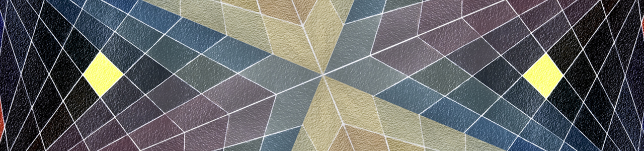
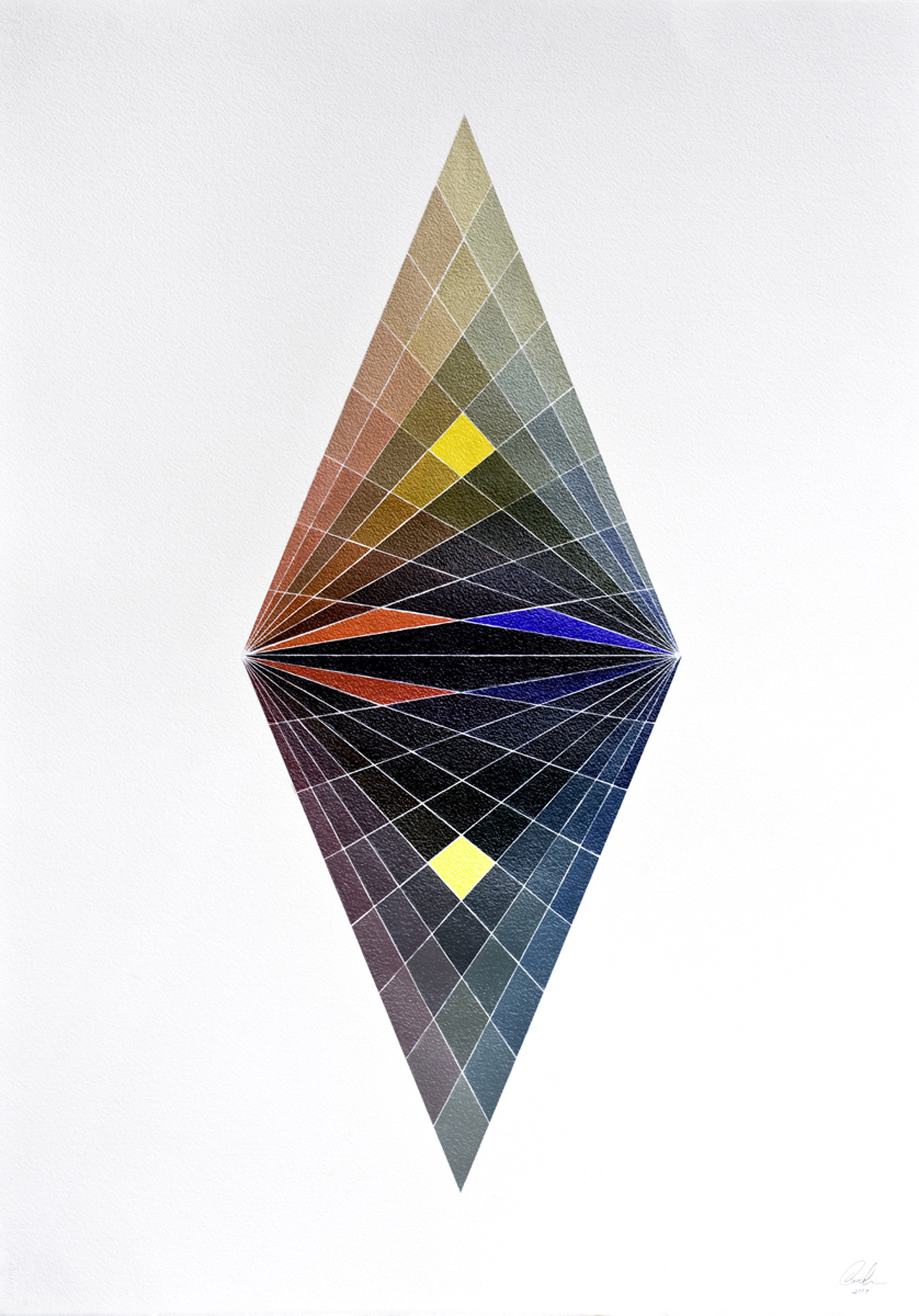
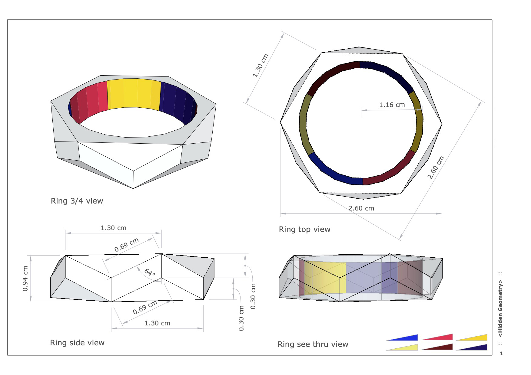
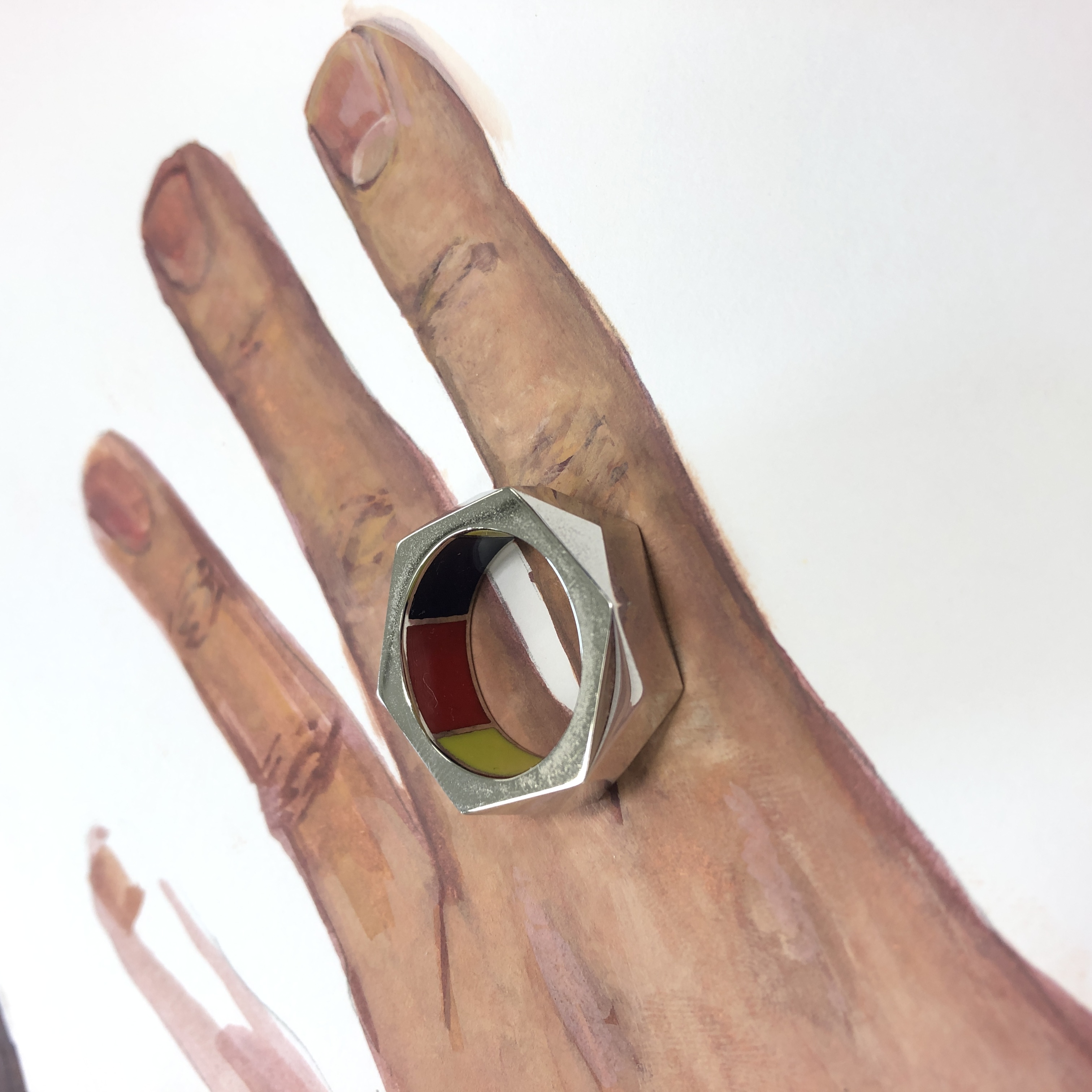
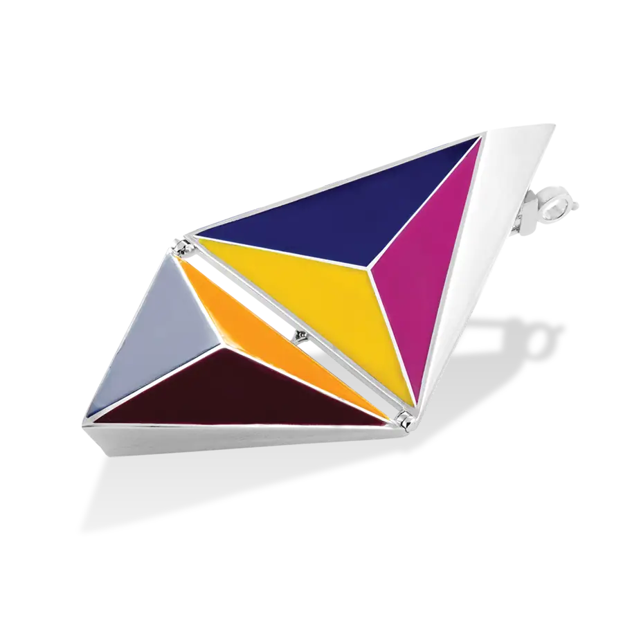
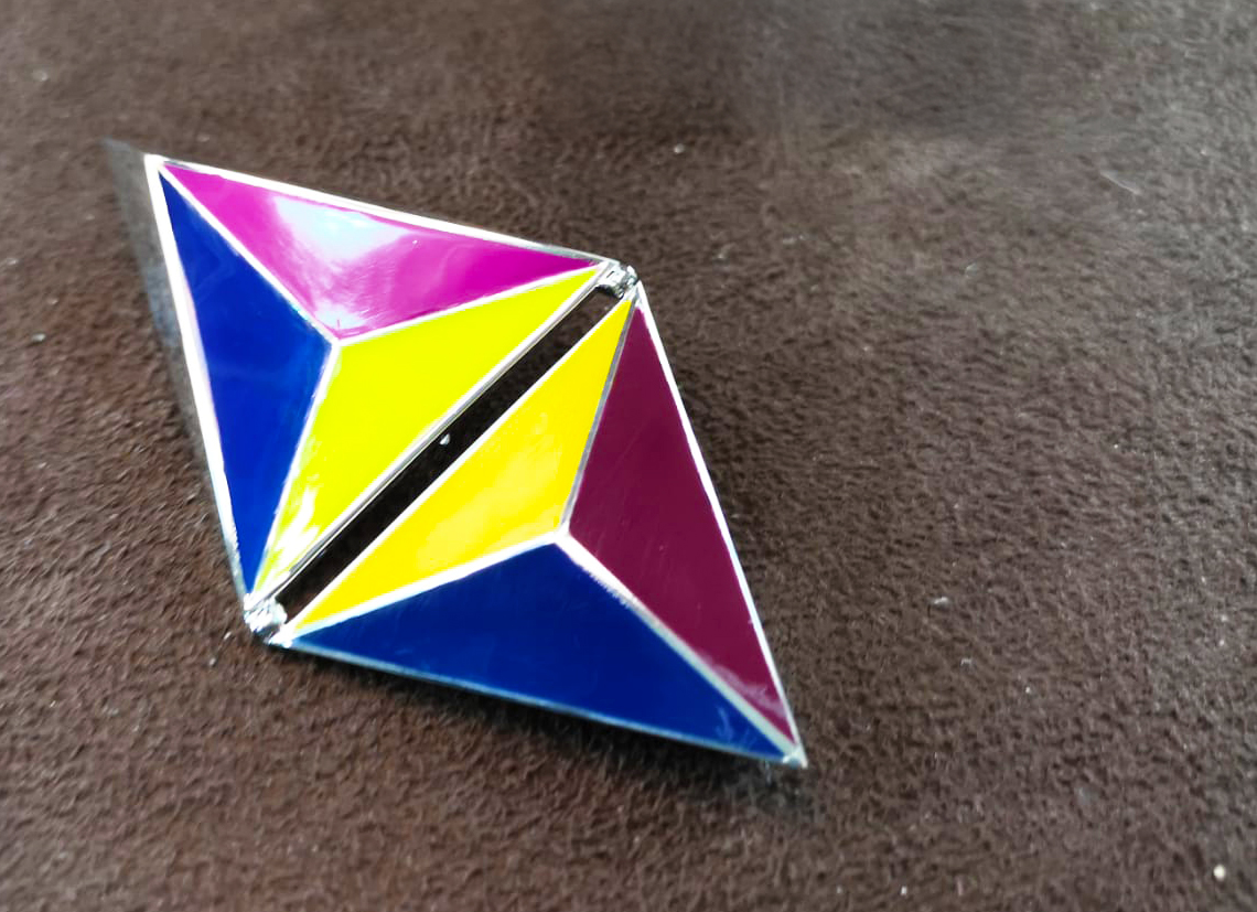
When On Cheong first invited me to collaborate with them, I had the idea to use my Bias colour chart from the Bias Colour Series to expand my exploration into skin tones and human nature.

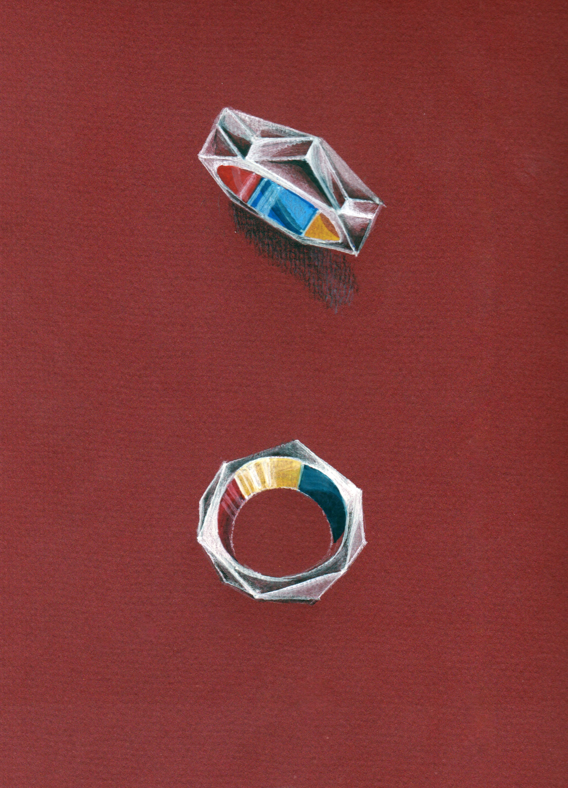
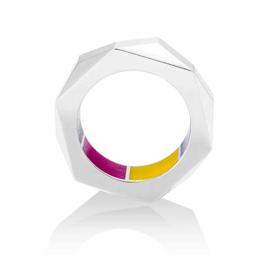
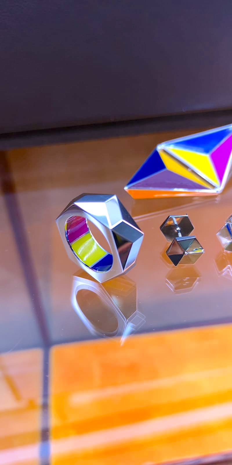
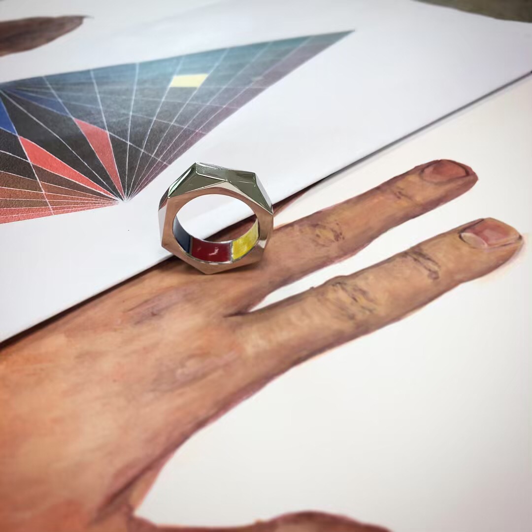
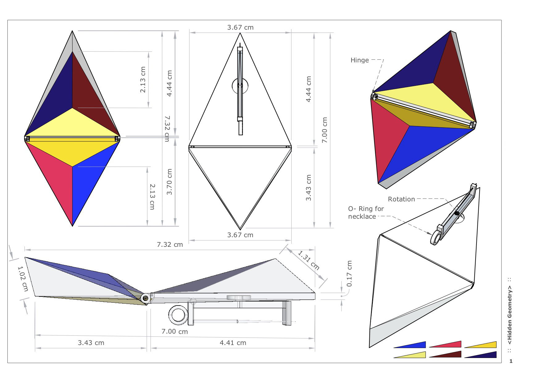
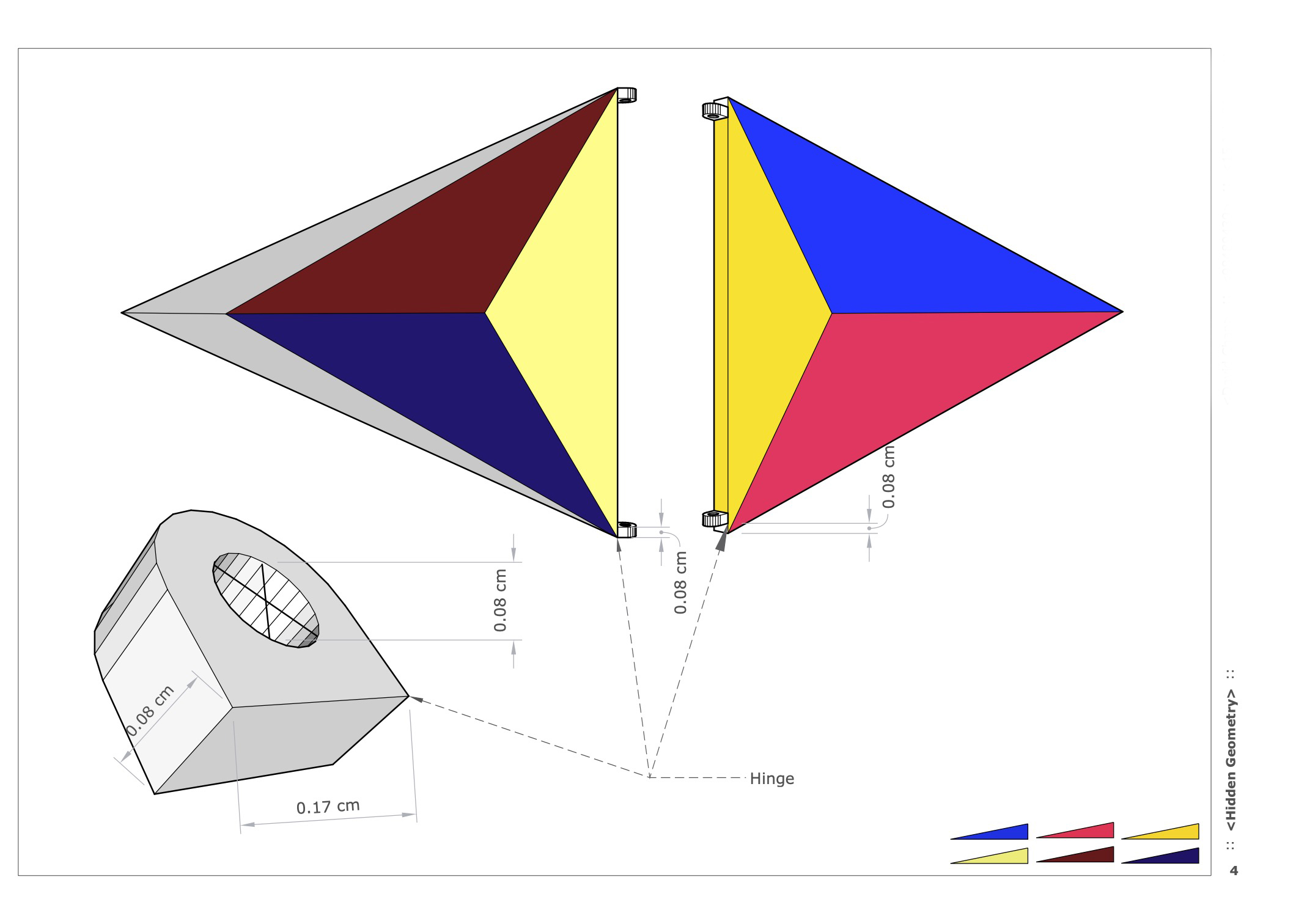
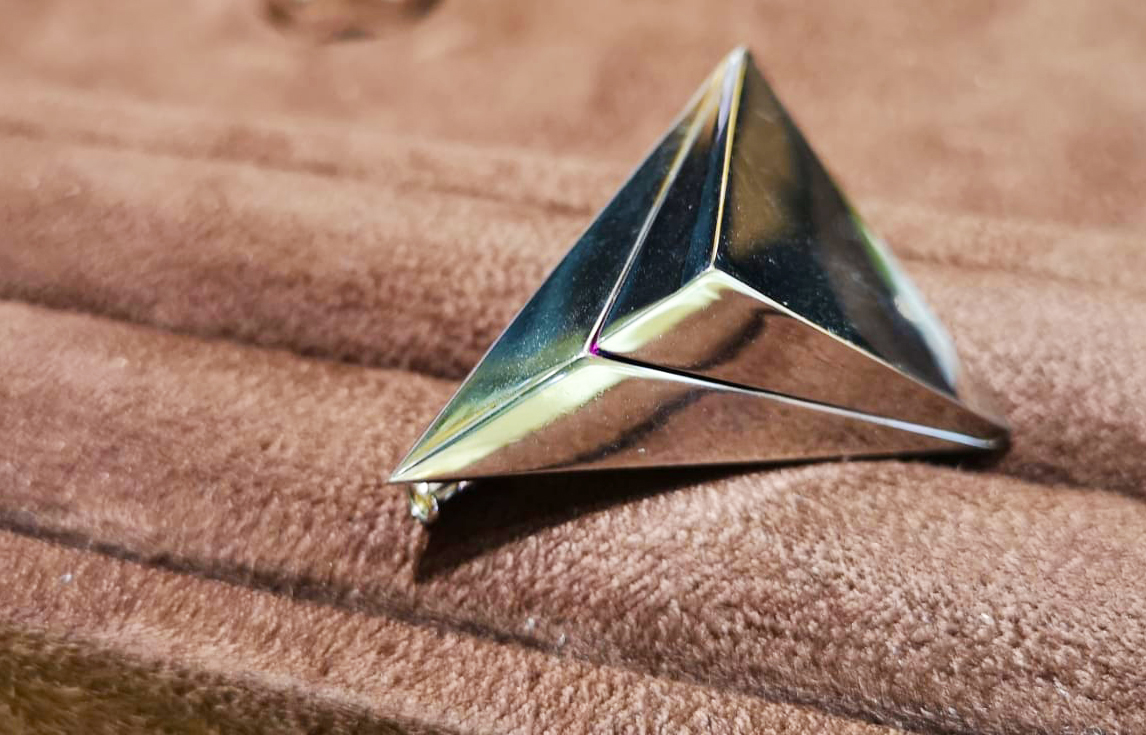
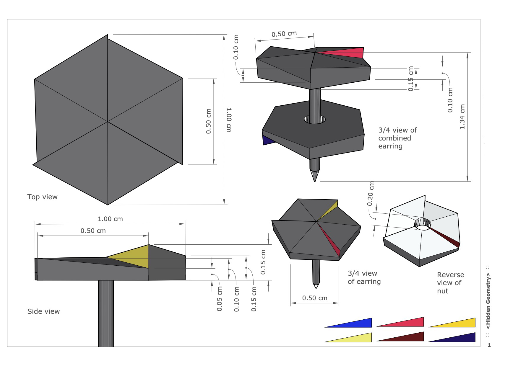
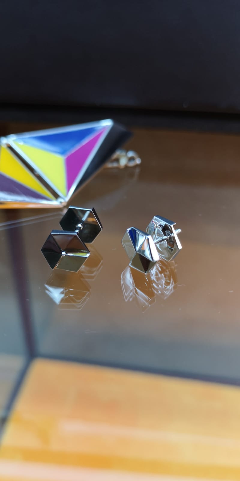
The central concept was to apply a hide-and-reveal approach to all the jewellery designs. This inspiration came from the dilemma of wanting to express ourselves but being too reserved or shy to show our true side. 

In each design, the primary colours that make up human skin, red, blue, and yellow, would be incorporated onto unique surfaces. The colours would be made of enamel, and the main jewellery would be platinum gold.  

Bias colour chart from the series Bias colours

Top of colour chart umbrella

Underside of colour chart umbrella


Ring

The ring was designed to show only platinum on the outside and enamel parts on the inside. The internal colours can only be revealed when the ring is removed. 


Brooch pin

The brooch pin was created with the concept of revealing and hiding. Like an armour plate, the cover can be closed to hide the colours inside or opened to invite conversation and reveal a brighter character. 


Earrings

The earrings were designed to look simplistic and plain from the front but seen from the side and in close-up, they reveal the same primary colours.